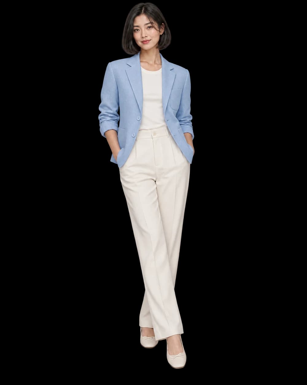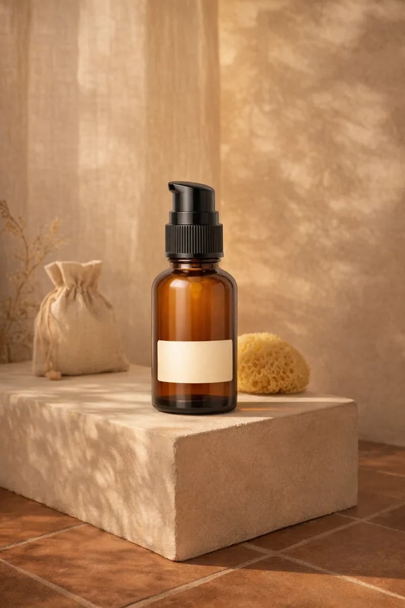
Tell the studio what must stay true, what the scene should do, and how you will judge the result.
Start with the placement
Before describing the scene, name the job. A product-page image needs different framing from a collection banner. A small social placement may need a bold silhouette; a detail section may need a readable fastening or surface texture. The destination helps you prioritize the brief instead of asking one image to satisfy every possible use.
Choose the aspect ratio and useful crop with that destination in mind. If a headline belongs on the left, ask for uncluttered space there and keep the product away from the edge. If the image must work as a thumbnail, make the item large enough to recognize without zooming. These are concrete decisions a reviewer can check.
State the non-negotiable product details
List the features that make the product itself: its silhouette, color, material, printed design and distinctive construction. Keep the source image clear enough to support those details. Written direction can identify what matters, but it cannot turn a hidden label or blurred seam into reliable source evidence.
Separate identity from styling. ‘Preserve the green glass bottle and front label’ describes the product. ‘Place it on a pale stone ledge’ describes the scene. That distinction helps when you revise: you can change the atmosphere without accidentally treating the packaging as another creative variable.
Make a few scene decisions well
Choose a surface or setting, a light direction and a camera relationship. ‘A warm plaster alcove, soft window light from the right, front three-quarter view’ gives the image a coherent starting point. Adding ten competing style references can make it less clear which instruction should win.
Use props sparingly and explain their role. A folded cloth might communicate softness; a crowded arrangement can obscure the product and add review work. If a prop suggests a size, ingredient or use that is not accurate for your product, remove it. Visual context is part of the message customers receive.
Turn the decisions into one readable brief
Try this structure: ‘Photograph the supplied product for [placement]. Preserve [identifying details]. Place it [setting and position], with [light]. Use [angle and framing]. Keep [necessary space or visibility].’ Fill the brackets with choices you can evaluate. You do not need every field when the source and selected tool already make the intent clear.
For a simple accessory image: ‘Photograph the supplied bag for a collection card. Preserve its silhouette, strap and hardware. Place it upright on a warm neutral surface with soft side light. Use a front three-quarter view, with the full bag visible and an uncluttered background.’ Adapt the description to your actual item instead of copying details the product does not have.
Write the review before the next prompt
After one quoted sample, compare the result with three questions: is the product correct, does the composition fit the placement, and does the scene support the intended story? Note the specific reason for rejection. ‘Strap attachment changed’ and ‘insufficient space for heading’ lead to different fixes.
Revise one important decision at a time where possible. When you find a workable direction, use it as a starting point for related products while continuing to inspect each output. A good brief is a reusable set of priorities, not a guarantee that every generation will satisfy them.