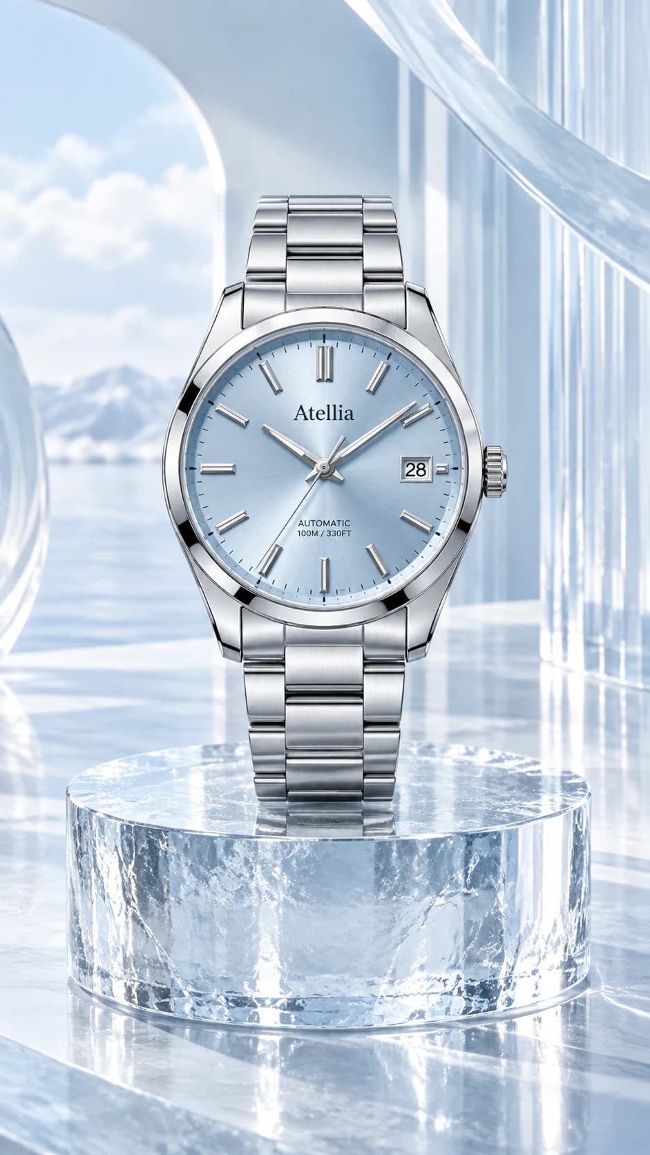
Dial markings and hand count. Case, crown and lugs. Strap links, stitching and clasp.
Read the dial before the composition
A watch photograph invites close scrutiny. Begin the review with the dial: markings, hands, date window and any visible subdials. A result can look luxurious while inventing a complication or rearranging the typography. Keep the original open beside it and compare the structure rather than the overall impression.
Choose a source where reflections do not hide the important markings. If the input is too small to read, the generated version cannot establish the missing detail. An original close-up is the better reference for exact text and fine construction.
Follow the case into the strap
Inspect the crown, case shape, lugs and the transition into the bracelet or strap. Make sure the arrangement is physically plausible and that a curved strap still connects where it should. Look at stitching, links and the clasp separately; similar color does not mean identical construction.
Use a restrained three-quarter angle when you want to show case depth. A more dramatic angle can make the dial harder to compare and may hide one side of the strap. For a first sample, clear geometry is more useful than the strongest visual effect.
Let light describe the finish
Soft controlled light can separate polished and brushed surfaces without covering the watch in glare. Check that a dark scene has not erased the dial or introduced illuminated features absent from the source. Preserve the complete timepiece in the final frame, including the strap ends where relevant.
Treat generated imagery as creative, not evidence of movement, water resistance, material composition or measurements. Keep your product specifications and original photographs available for those claims. When a sample passes, extend the direction one product at a time and retain accepted outputs while revising only the details that need another attempt.