Learn to review generated fashion images for construction, proportion, and product fidelity before using them in commerce.
The starting point
A fashion image can be persuasive at first glance and inaccurate on closer inspection. A seam moves. A cuff gains a button. A print becomes a related but different pattern. For a mood board, an invented detail may be harmless. On a product page, it can change what a customer believes they are buying.
The practical response is to separate visual appeal from product approval. Both matter, but they answer different questions. Does the frame communicate the intended mood? Does it represent the item accurately enough for its intended use? Give each question a deliberate review rather than treating a polished finish as proof of both.
Make a garment evidence sheet
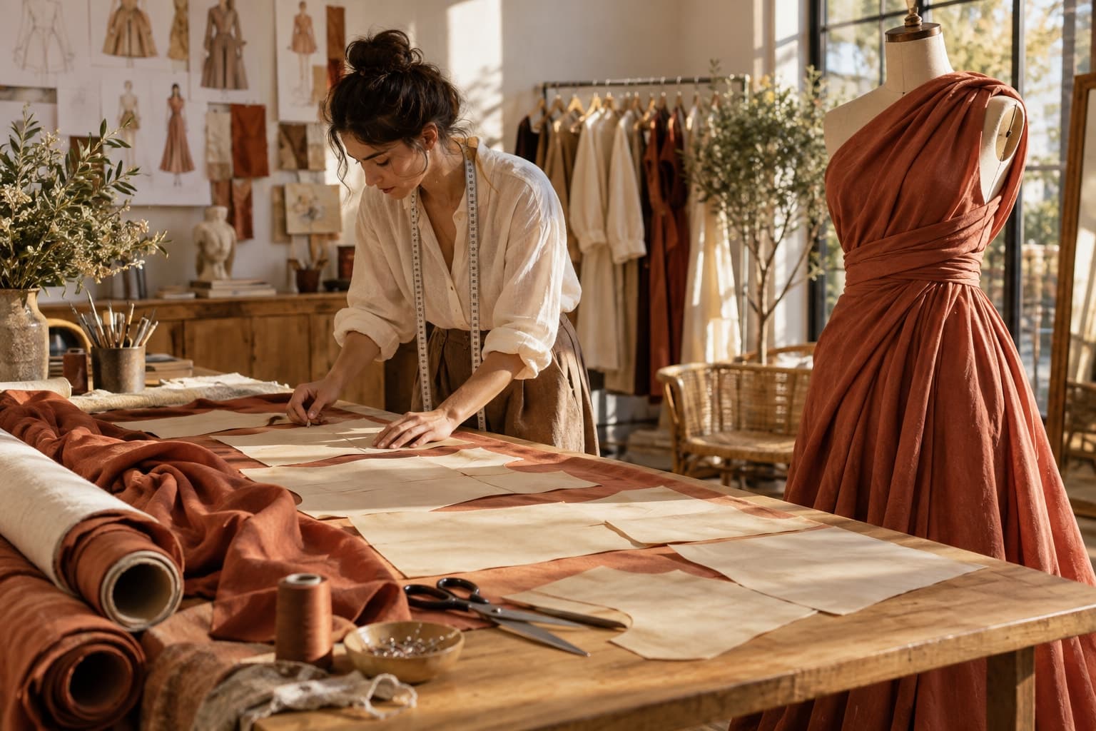
Before generating anything, collect clear references for the details that must survive. Include front and back, a close view of distinctive construction, and a written description of features that could be missed. Note the actual number of fasteners, the shape of the pockets, where the hem lands, and whether the fabric is opaque or sheer.
Avoid asking one low-resolution photograph to carry every fact about a garment. If the source does not reveal a lining or the back of a collar, a resulting image cannot serve as evidence of that hidden feature. Supply another reference or keep that area out of the commercial frame.
Review in three passes
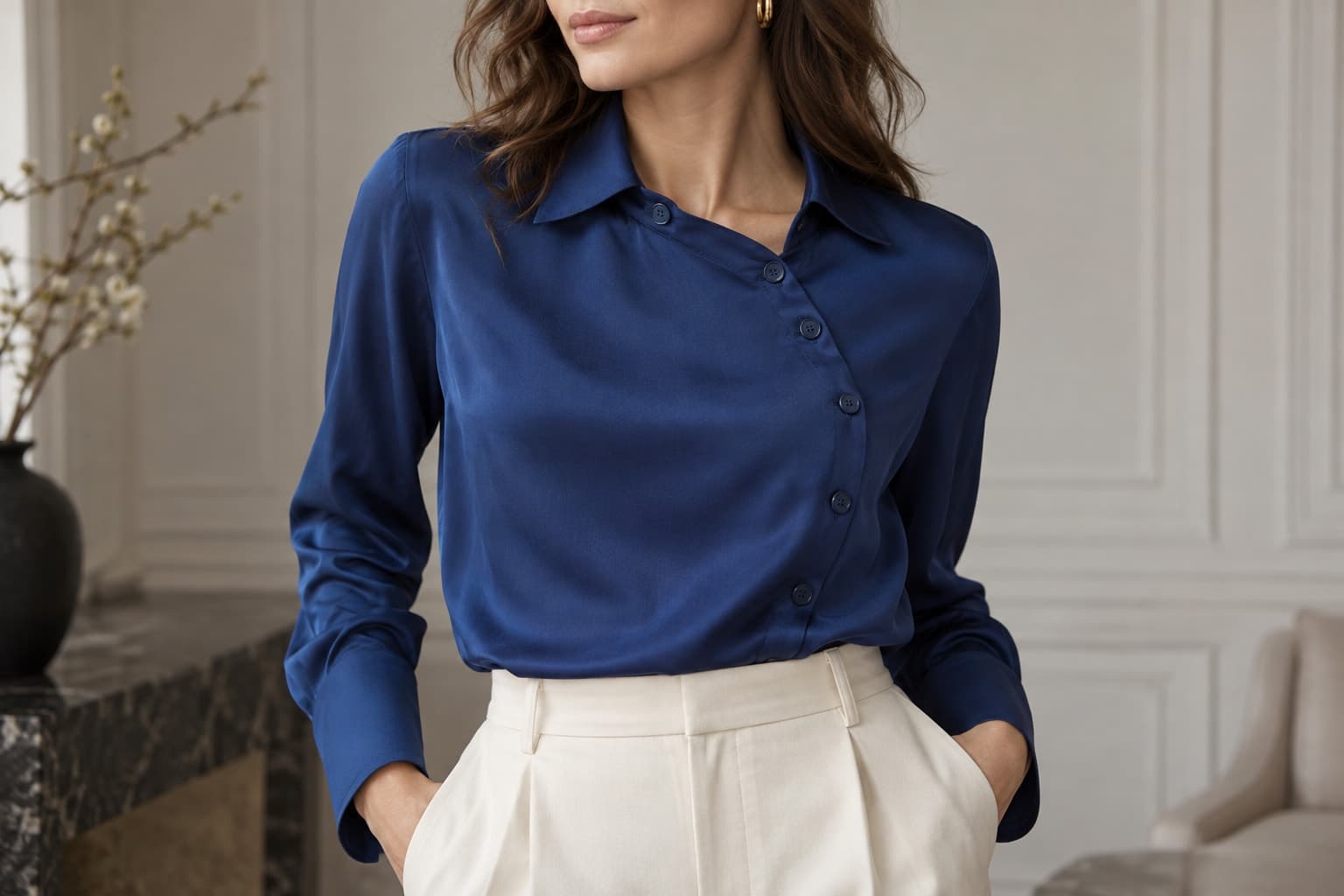
Start with identity: is this still the same product and color variant? Next inspect construction: seams, closures, trims, openings, and logos. Finish with physical plausibility: the way fabric meets the body, overlaps itself, and responds to the pose. This order helps reviewers avoid spending time polishing an image that should be rejected.
Do not rely exclusively on a zoomed view. Check the full composition, the crop intended for the website, and detailed sections. A sleeve may look acceptable alone while the overall silhouette has changed. Conversely, a convincing silhouette can conceal a distorted fastening when reduced to a thumbnail.
Record the failure, not just the dislike
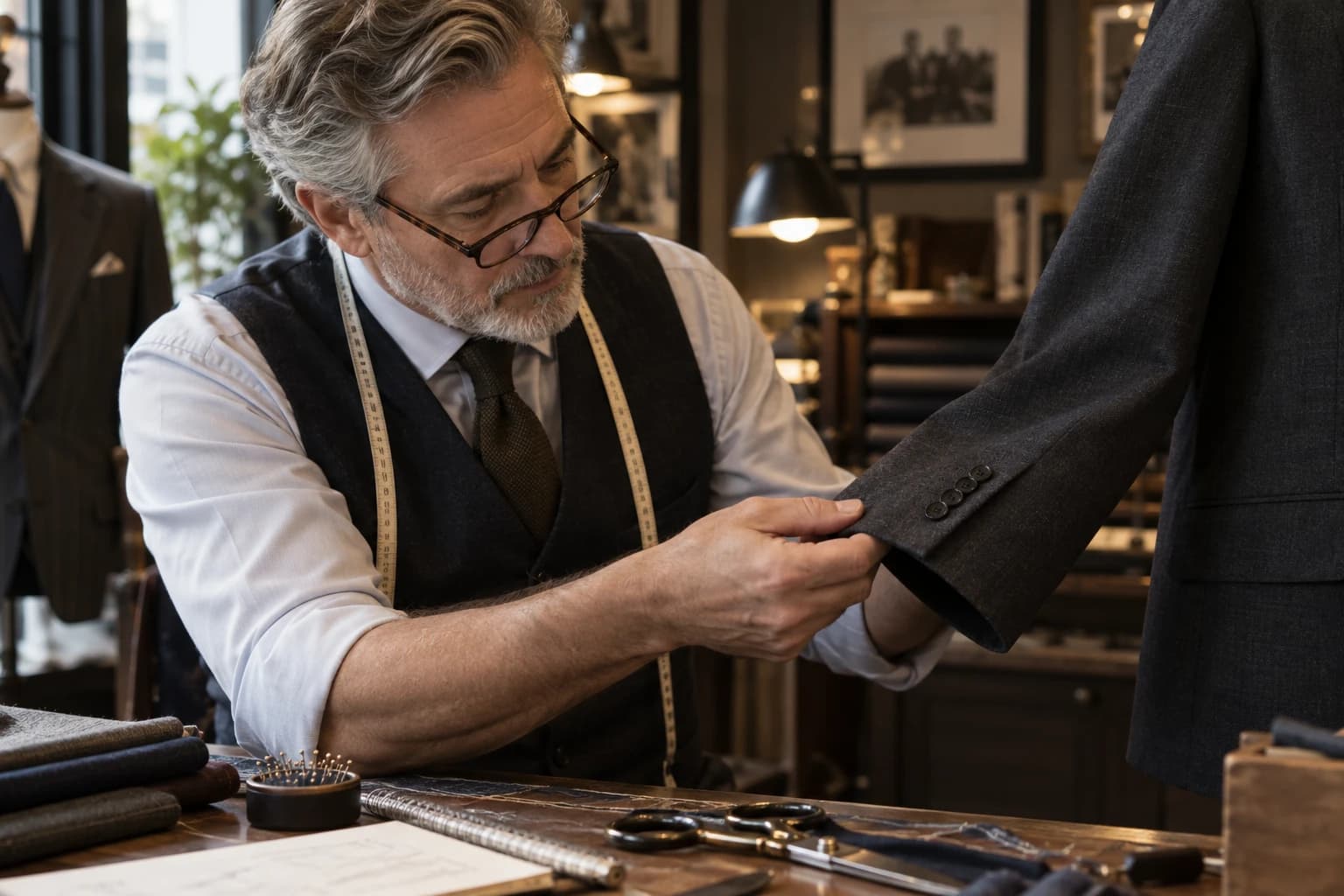
Feedback such as unrealistic or strange gives the next attempt little direction. Write a concrete difference: the source has four visible buttons but this result has five; the left pocket has moved above the waist; the cuff is narrower than the sample. Attach a marked reference where helpful.
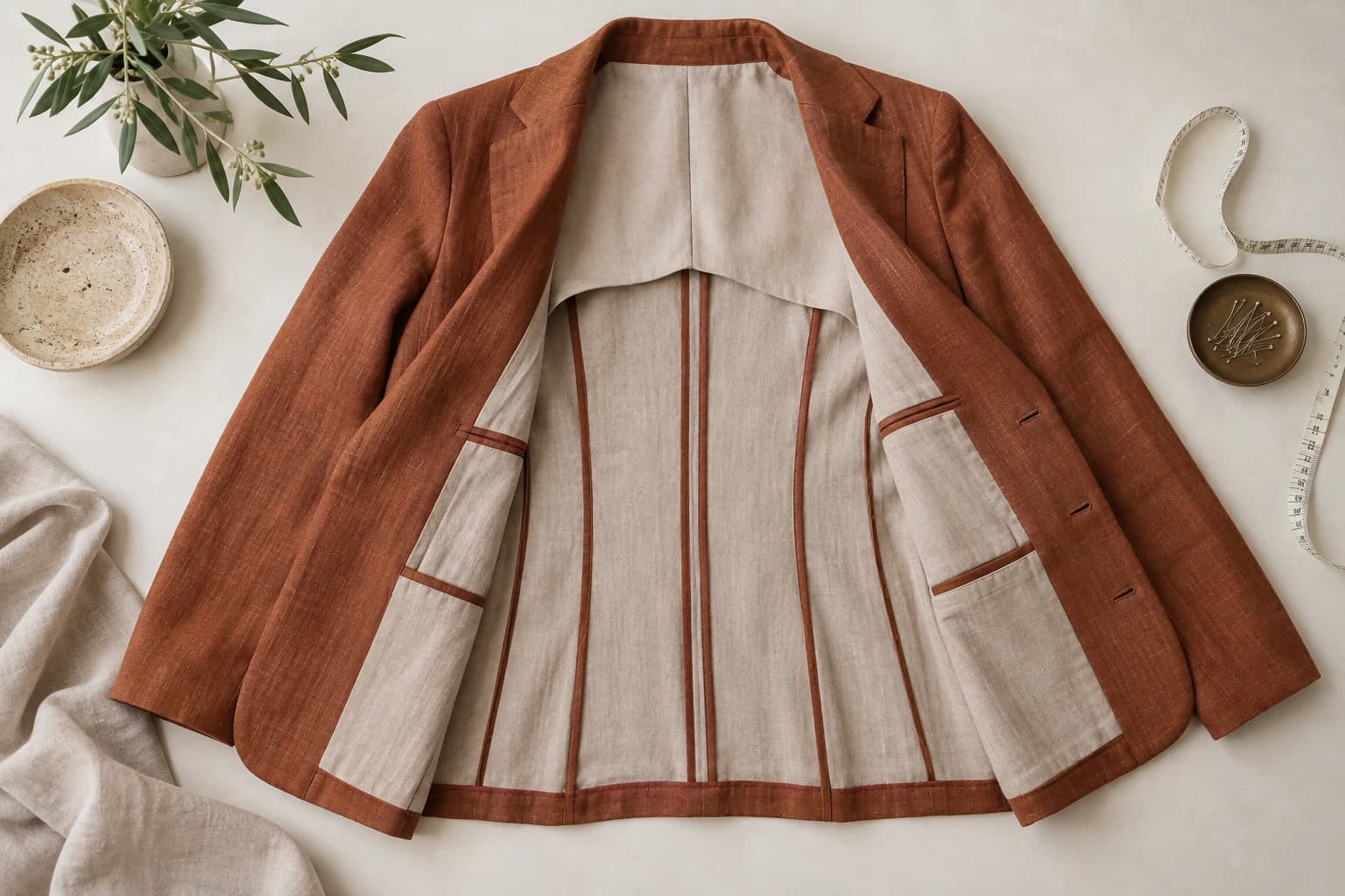
In a hypothetical linen-blazer review, the team rejects a beautiful seated pose because the jacket gains a belt. The next attempt simplifies the pose and keeps the waist visible. If the detail still cannot be preserved, the team uses a real photograph for that product angle instead of repeatedly relaxing the standard.
Define where each image may appear
An image approved for creative exploration is not automatically approved for a listing. Assign intended uses before export: concept, campaign illustration, supporting editorial, or product evidence. Keep the source references and reviewer decisions with the approved file so a later team does not mistake an exploratory asset for a verified product photograph.
- Reject changes to sellable product features.
- Escalate uncertain color or fit to someone with the sample.
- Retain real detail photographs where generated views are ambiguous.
- Label conceptual imagery in the surrounding editorial context.
Quality control becomes easier when rejection is a normal part of the workflow. The objective is not to prove that every generated frame works. It is to establish which frames are useful, what they demonstrate, and where their limits need to remain visible.