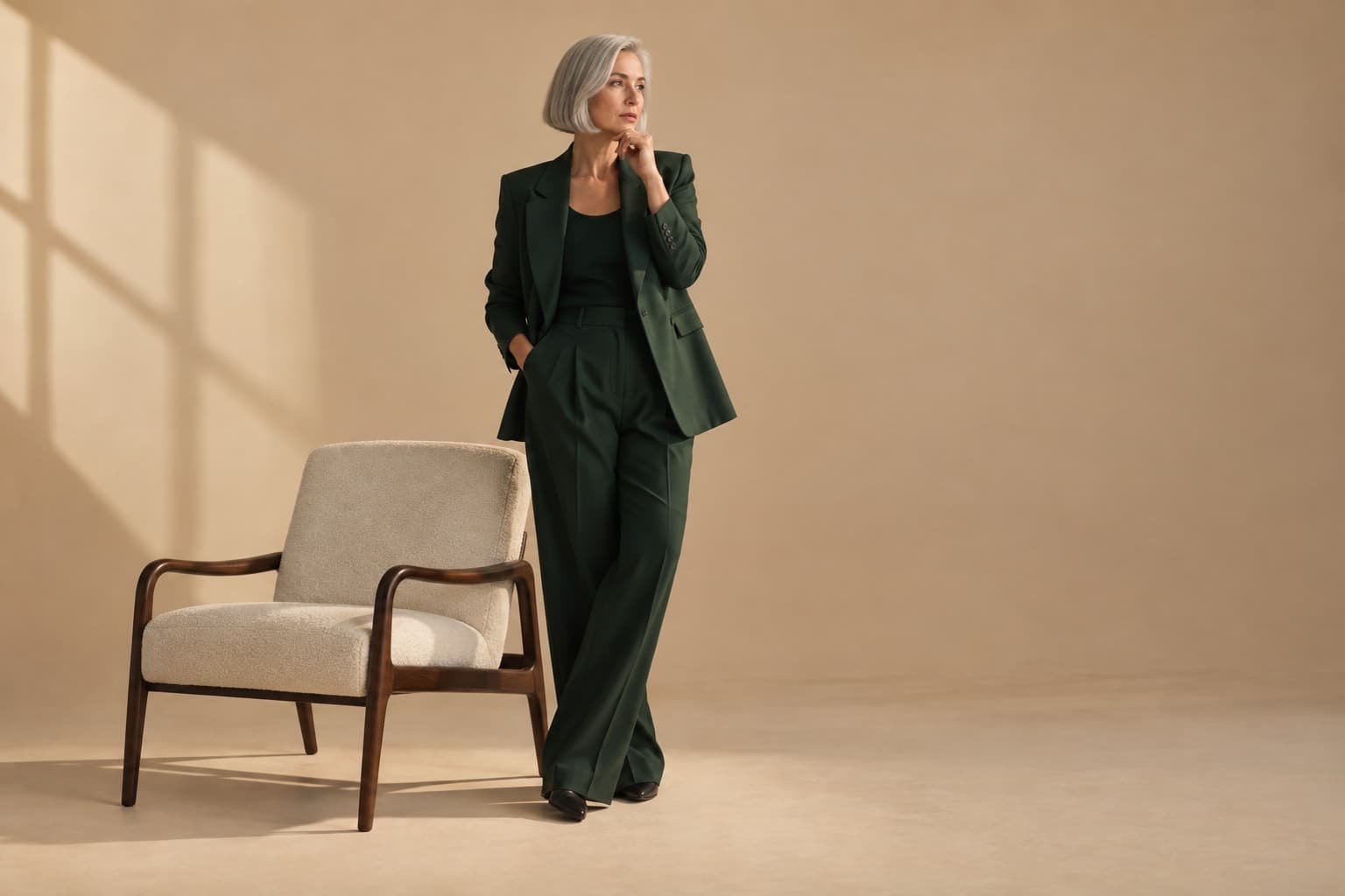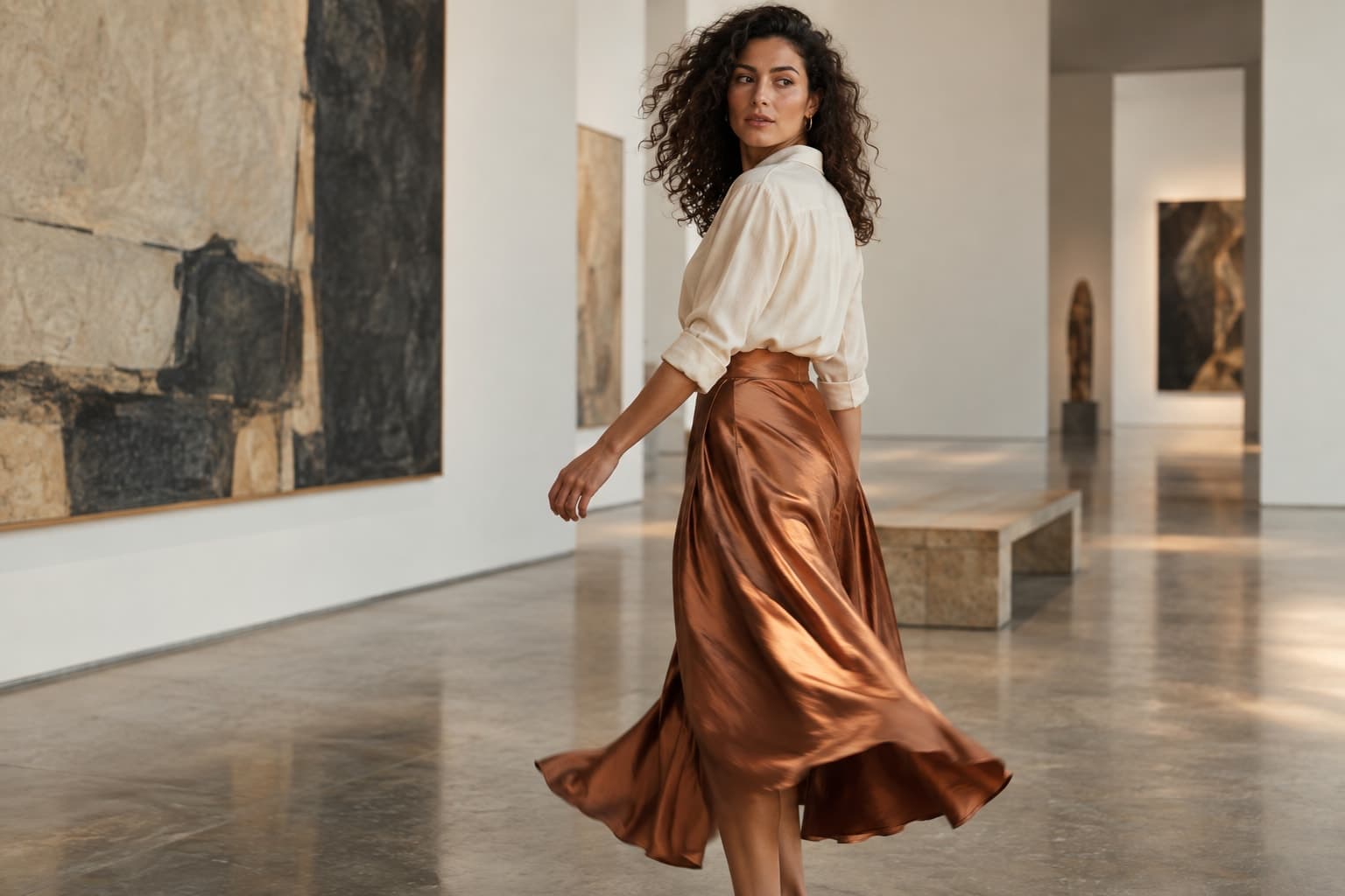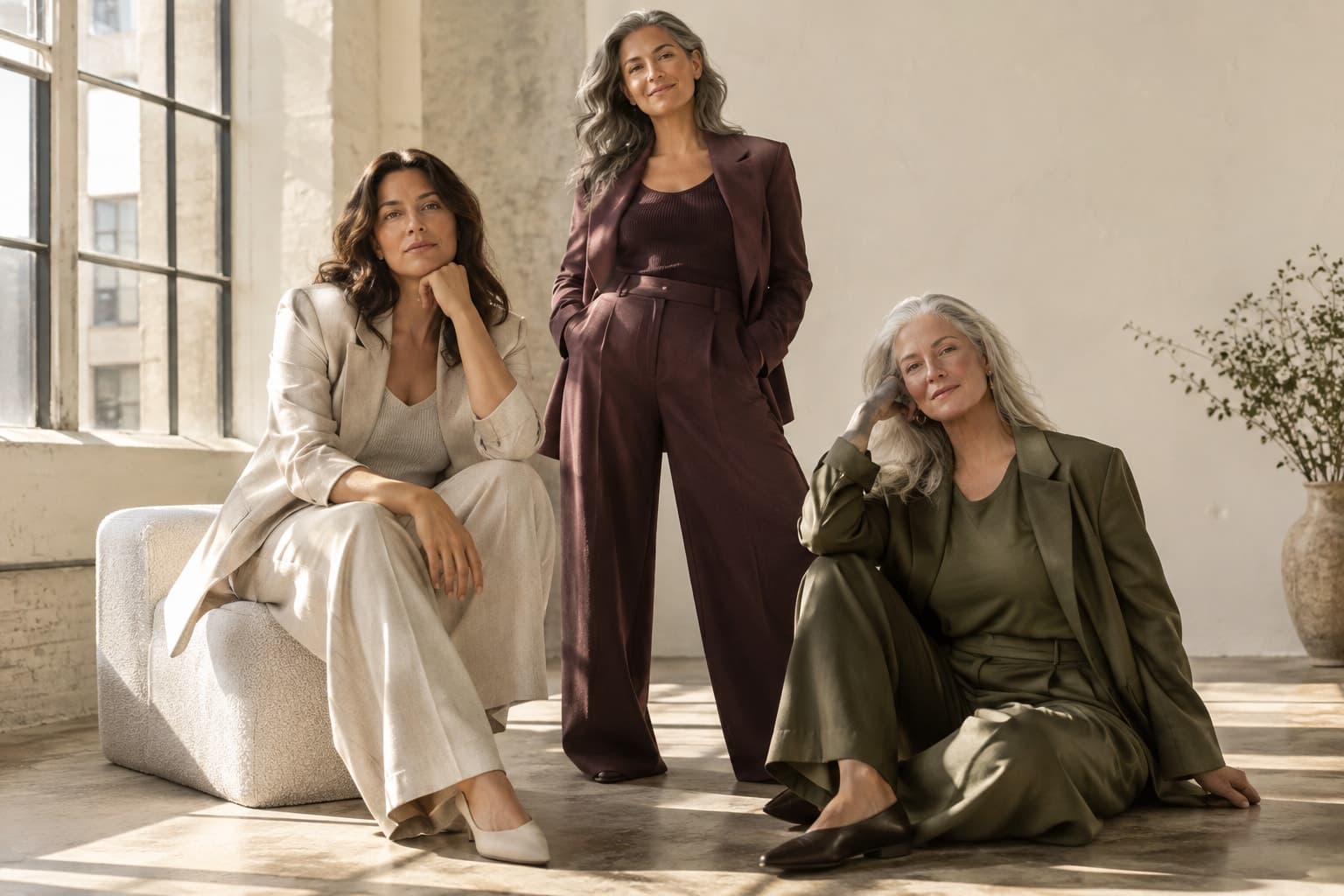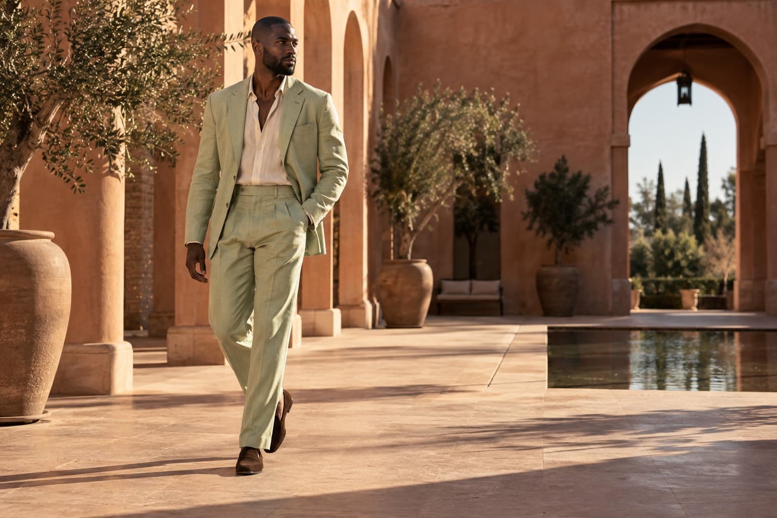
Build a collection narrative with an opening, a rhythm, useful product context, and a deliberate final frame.
The starting point
A lookbook is a sequence, not a storage place for every strong image. Its job is to help someone understand a collection: the shapes that recur, the relationships between pieces, and the world the clothes belong in. That understanding depends as much on editing as on image production.
Before making new assets, gather the actual collection information. List the looks, the hero pieces, the supporting items, and the products that need a clear explanation. Decide who will use the lookbook. A wholesale buyer may need product references and availability information; a customer may need a more intuitive route from a mood image to a specific piece.
Begin with a small storyboard
Draw a rough sequence on paper or in simple rectangles. Use words before polished images: opening mood, first complete look, fabric detail, contrast in silhouette, second setting, closing image. This makes gaps visible without letting a favourite photograph dictate the entire structure.
For a hypothetical coastal capsule, the opening could establish light and palette, followed by a clear linen outfit and a closer view of its texture. The sequence might then introduce a darker evening look before returning to a quieter final frame. These are proposed creative choices, not a claim about a real Atellia collection.
Establish a visual rule, then vary it deliberately
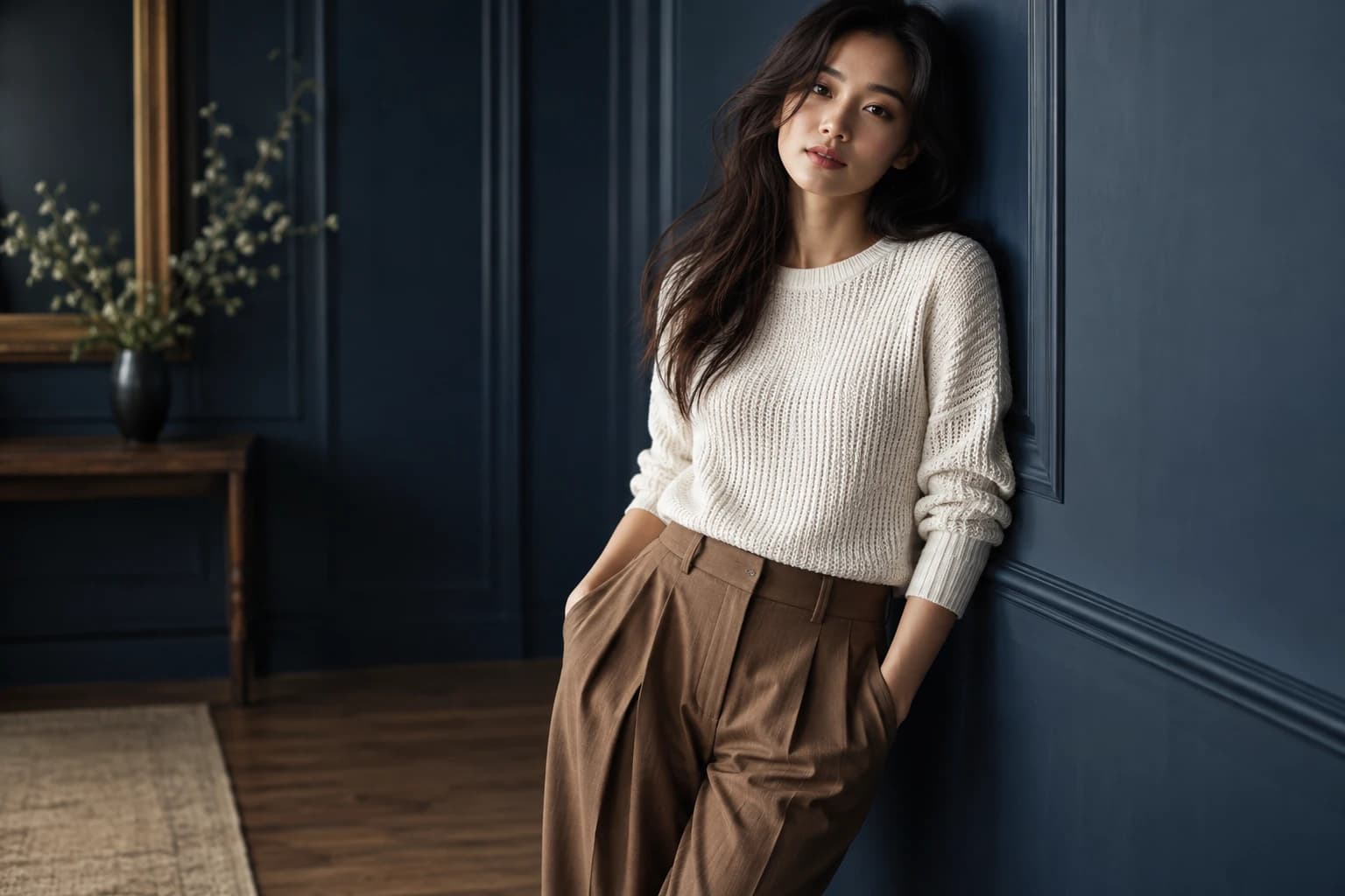
Choose a consistent treatment of colour, light, and product scale. That shared language lets you vary pose, distance, and layout without making the collection feel disconnected. If every page has the same full-length composition, the reader may stop noticing the differences between garments.
Place dense images beside quieter ones. Follow an expansive scene with a detail that rewards attention. Use white space or a simple background when the collection needs a pause. Variation feels purposeful when it supports the clothing rather than competing to make every page a campaign poster.
Make each garment easy to identify
A mood image may contain several pieces, some partly hidden. Provide a clear route to the relevant product information. In a digital lookbook, test those links on mobile. In a downloadable version, use legible product names or codes and avoid captions so small that they become decoration.
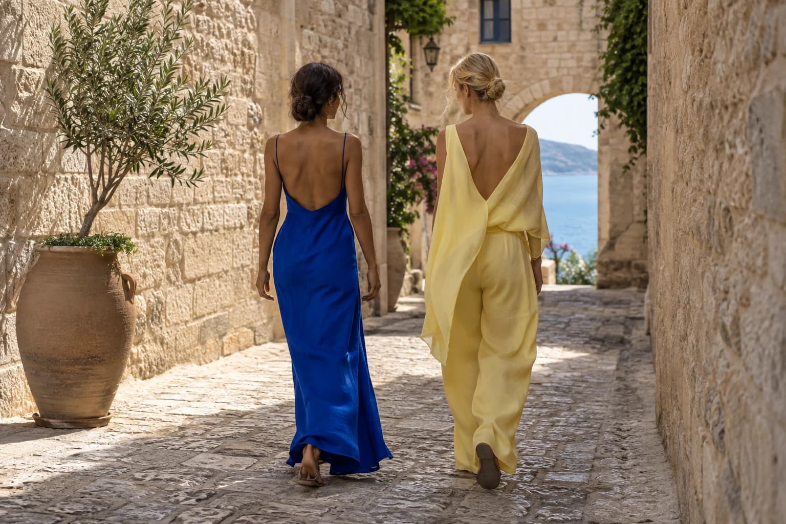
Check the collection as it exists, including colourways and final samples. Generated imagery should be approved against real references before it enters the sequence. If a styling image suggests a belt, lining, or accessory that is not included, clarify the composition in the accompanying information.
Edit by role, not attachment
When two images do the same job, choose the one that serves the sequence better. An excellent portrait can still be unnecessary if another frame already provides the same emotional beat and shows the garment more clearly. Move unused favourites to a separate campaign folder rather than forcing them into the book.
Ask a teammate unfamiliar with the storyboard to review the sequence. Can they describe the collection after a quick pass? Can they locate a particular item? Do any frames feel like they belong to another season? Their confusion is useful evidence about where the edit needs work.
Finish by checking the experience in its actual format. A spread that works on a large screen may become two disconnected pictures on a phone. The final lookbook should retain its rhythm, its product connections, and its sense of place wherever someone encounters it.