Use a 2025-themed creative workshop to distinguish lasting brand codes from decorative nostalgia in luxury product imagery.
The starting point
This 2025-themed workshop explores a durable creative question: how can a brand show continuity without making every new collection look archival? It does not claim to summarize the luxury market in that year. The exercise begins with your own products and records, where evidence of a brand's visual identity is more useful than a general claim about what luxury should look like.
Name the codes you can point to
Gather approved packaging, product photographs, campaigns, and construction details. Identify specific recurring decisions: a proportion, a fastening, a color relationship, a kind of negative space, or a particular treatment of material. Avoid abstractions such as 'timeless elegance' unless you can show what they mean in an image. A code becomes useful when another person can recognize it.
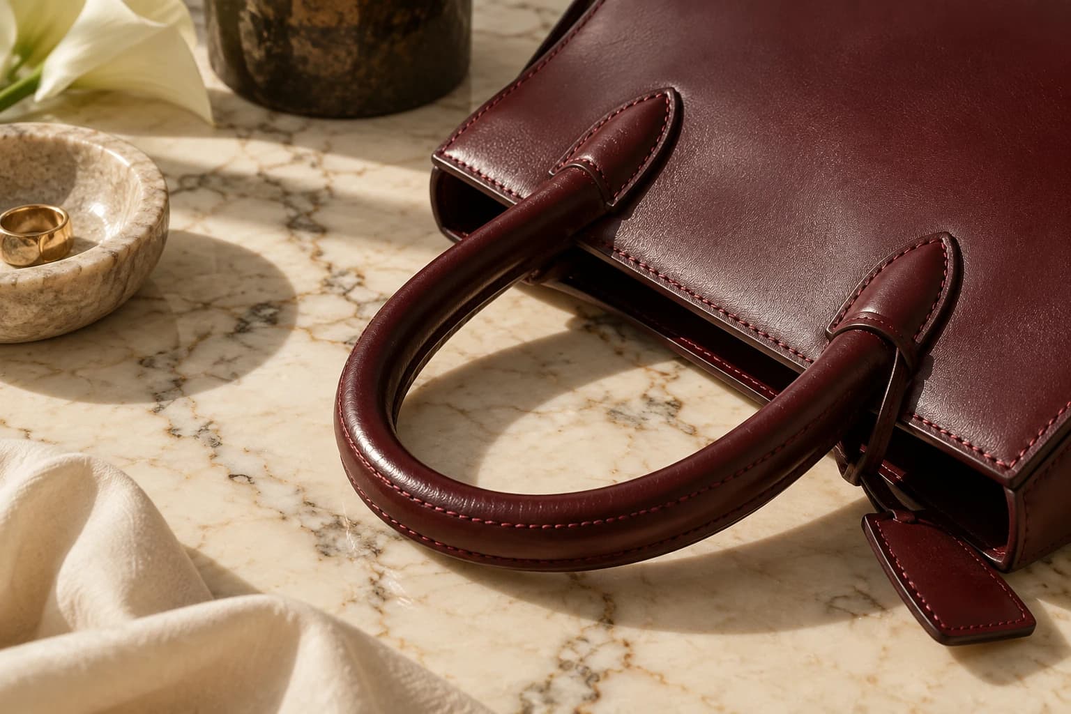
Separate long-standing brand evidence from recent styling habits. A cream background might be a recent campaign choice rather than a meaningful part of the identity. A distinctive handle construction may carry more continuity than the setting around it. This distinction prevents a new creative team from treating every familiar detail as untouchable.
Translate the code into a contemporary composition
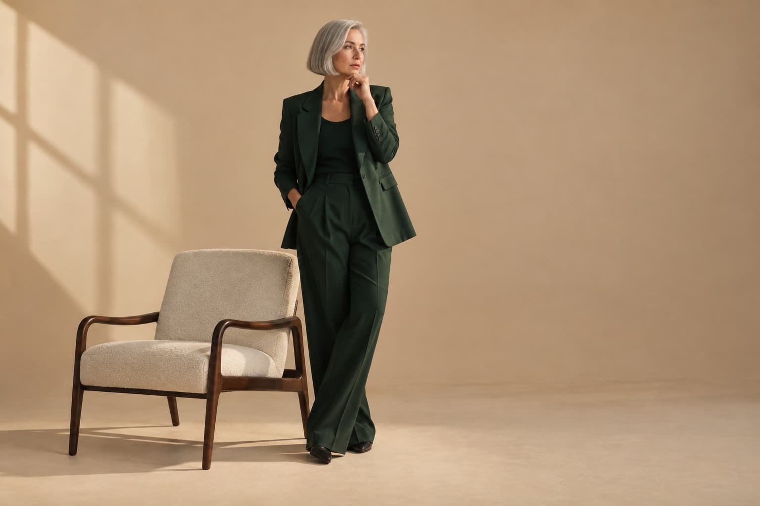
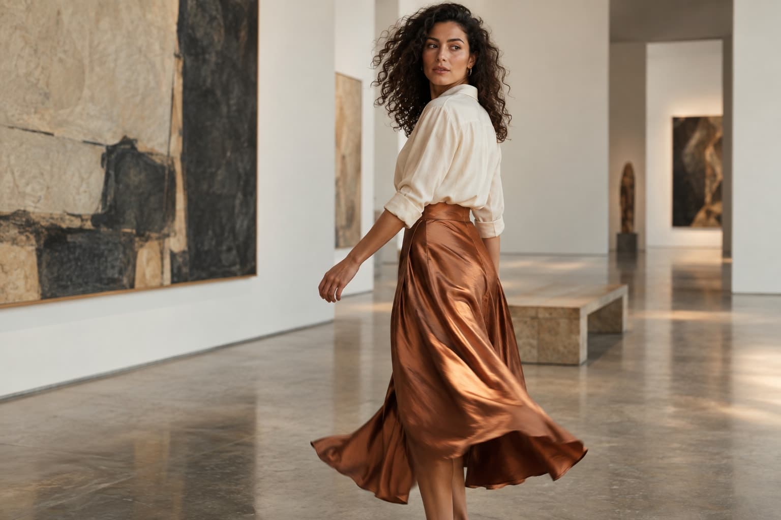
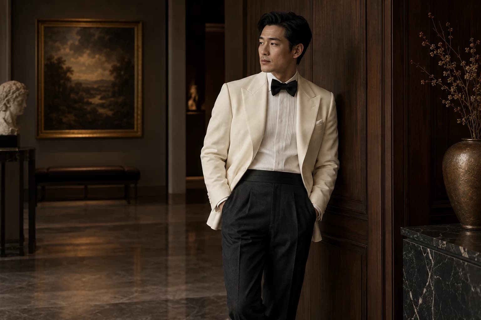
Choose one established code and one new visual decision. A hypothetical label known for precise tailoring could pair a restrained pose with an unexpected architectural crop. A brand with decorative hardware could use a very simple set that gives the hardware more space. The new element should sharpen attention to the product rather than compete with it.
Build a small comparison board with the same product in each version. Label what changes: distance, light, styling, or setting. Ask reviewers which version makes the product's particular qualities easiest to describe. This moves the conversation away from personal preference and toward the intended role of the image.
Let material justify the close-up
Close details can communicate care when they reveal something real. Select a seam, edge finish, lining, or surface that deserves attention, then photograph it accurately. Avoid treating blur, deep shadow, or a metallic highlight as automatic signals of quality. If the viewer cannot understand what the image shows, atmosphere may be replacing information.
Generated editorial imagery needs especially careful review around materials and construction. A plausible leather texture, reflected clasp, or repeated stitch can differ from the actual item. Use accurate source photographs for product evidence and keep speculative visual exploration distinct. Do not invent a craft process or production origin to explain an attractive image.
Build a sequence with room to breathe
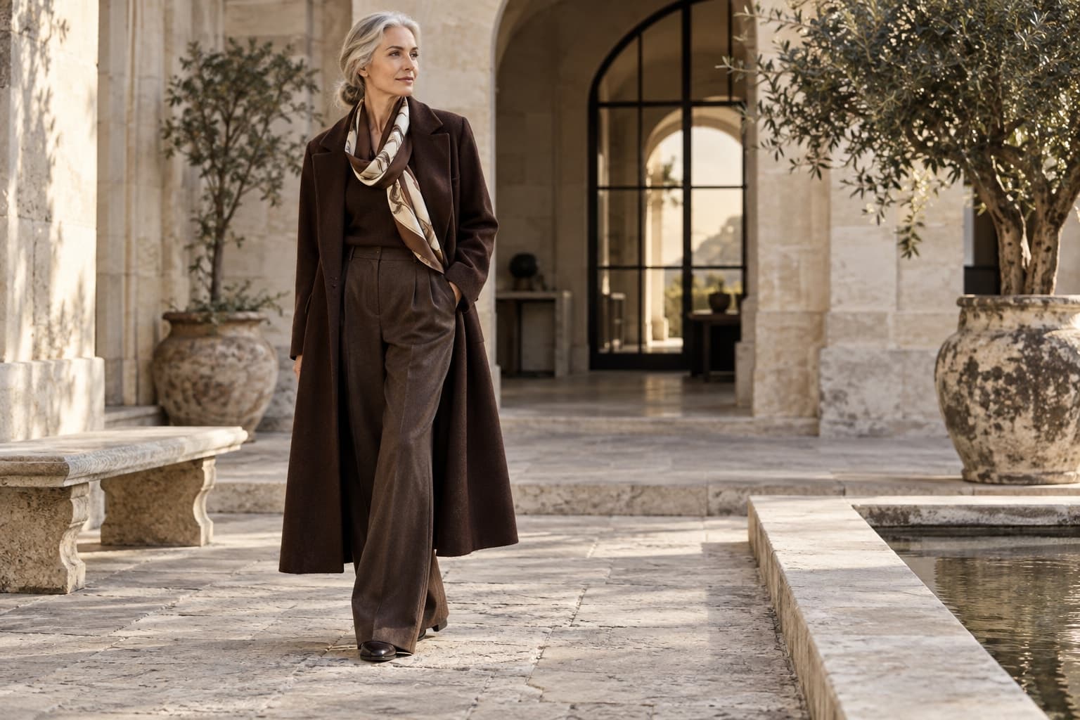
Pair a wide composition with a closer view and a product-led frame. The sequence can be calm without becoming empty: each image should reveal a different quality. Plan how captions and product names will sit alongside the pictures. Dense promotional copy can fight a restrained visual system even when the photographs themselves are coherent.
For an internal review, remove logos temporarily and examine the contact sheet. Discuss which decisions feel specific to the brand and which could belong to almost anyone. This is a creative exercise, not a scientific recognition test. Its value is in exposing generic styling choices that have been mistaken for identity.
Write the final direction as a short working guide: the product qualities to reveal, the recurring codes to preserve, and the experiments worth pursuing. A strong luxury image does not need to explain its own importance. It gives the viewer enough precise information to notice why the object is particular.