Build a controlled creative test around occasion, detail, and silhouette without losing sight of the product you sell.
The starting point
The easiest way to produce a forgettable fashion advertisement is to ask for something beautiful before deciding what the shopper should notice. A dramatic setting can be useful, but it cannot rescue an unclear proposition. Start with a garment, a plausible reason to wear it, and one feature the image can communicate honestly.
For an AI-assisted campaign, hold the product reference constant while exploring different creative ideas. This keeps your attention on the message instead of rewarding whichever generation happens to contain the most spectacle. You are building a testable set of advertisements, not a folder of unrelated mood images.
Direction one: show the occasion
An occasion-led image answers, “Where would this belong in my life?” For a hypothetical relaxed linen shirt, that might be a slow morning away, a summer commute, or dinner outdoors. Pick one. Combining every possible use into the same frame usually creates visual noise and leaves the garment competing with props.
Write the scene as a short production brief: the wearer is arriving at a terrace, the shirt remains fully visible, the sleeves match the reference, and the light feels late afternoon. Reserve a quiet area for copy. Avoid scenery that implies performance claims you cannot support, such as presenting ordinary clothing as protective equipment in extreme conditions.
Direction two: let a detail carry the message
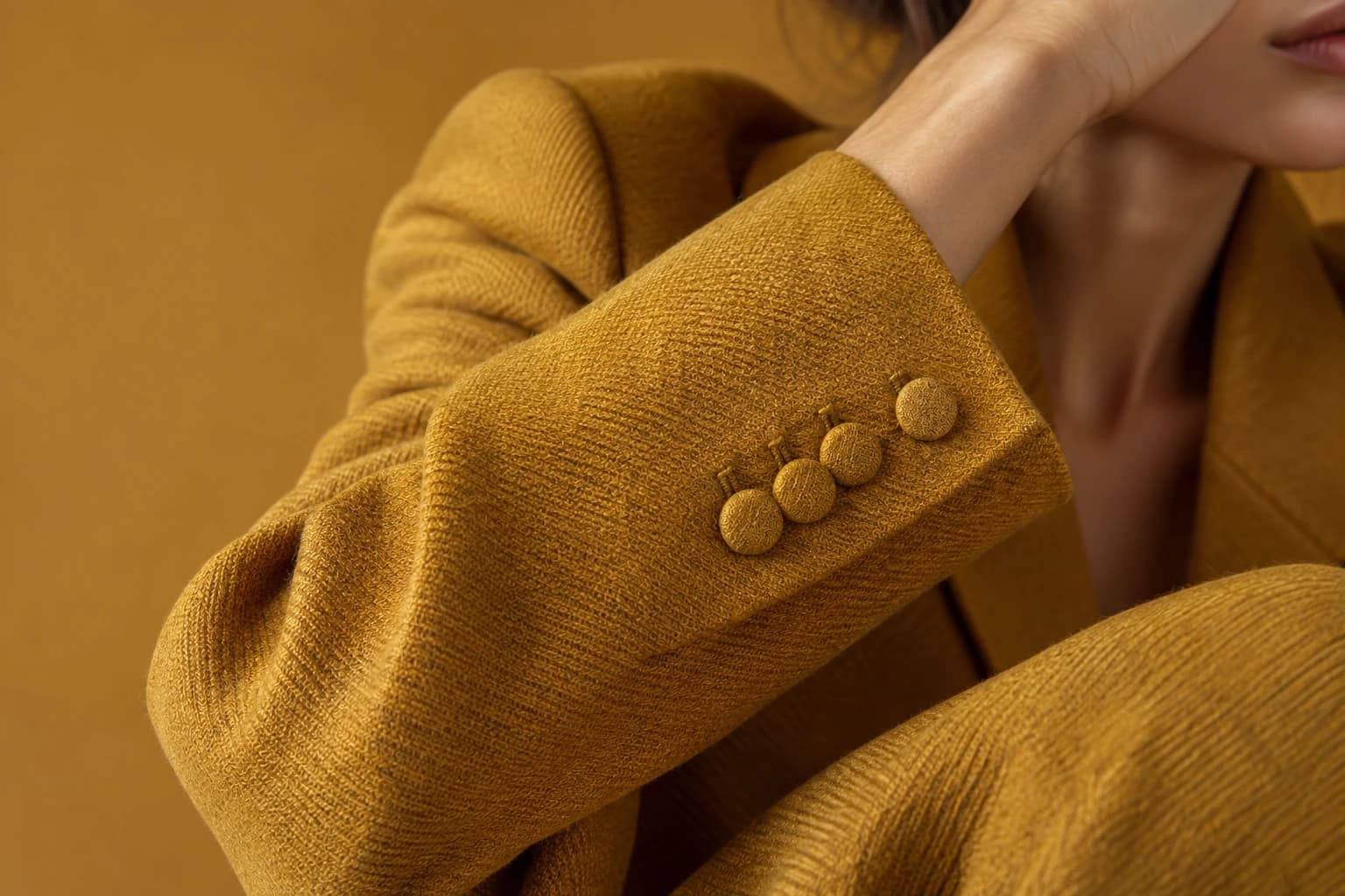
A detail-led advertisement is useful when the garment has something worth examining: a distinctive fastening, a considered seam, an unusual texture, or a lining treatment. The reference must show that feature clearly. If it does not, capture a new photograph instead of asking a generator to invent the missing construction.
Pair the detailed crop with a wider view elsewhere in the journey. A close-up may make someone curious without explaining length, fit, or overall silhouette. Use copy that describes what is visible and verified. “Contrast stitching at the pocket” is stronger than an unsupported statement about exceptional durability.
Direction three: make the silhouette unmistakable
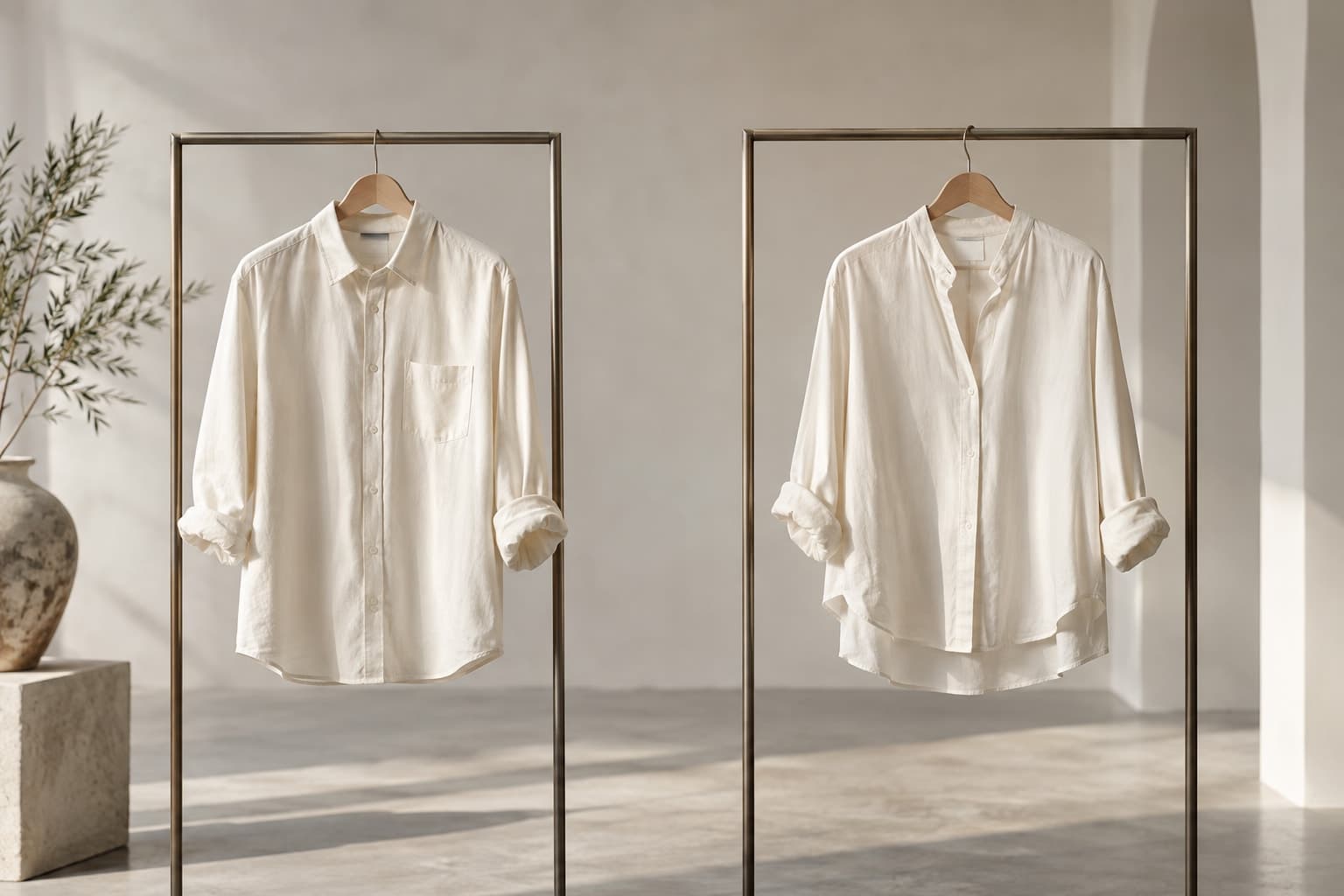
A silhouette-led image simplifies the scene. Use separation between garment and background, a pose that reveals shape, and a crop that preserves the hem and sleeves. For our hypothetical shirt, this could be a straightforward standing pose that shows the relaxed body and shoulder line. Keep styling consistent across test versions.
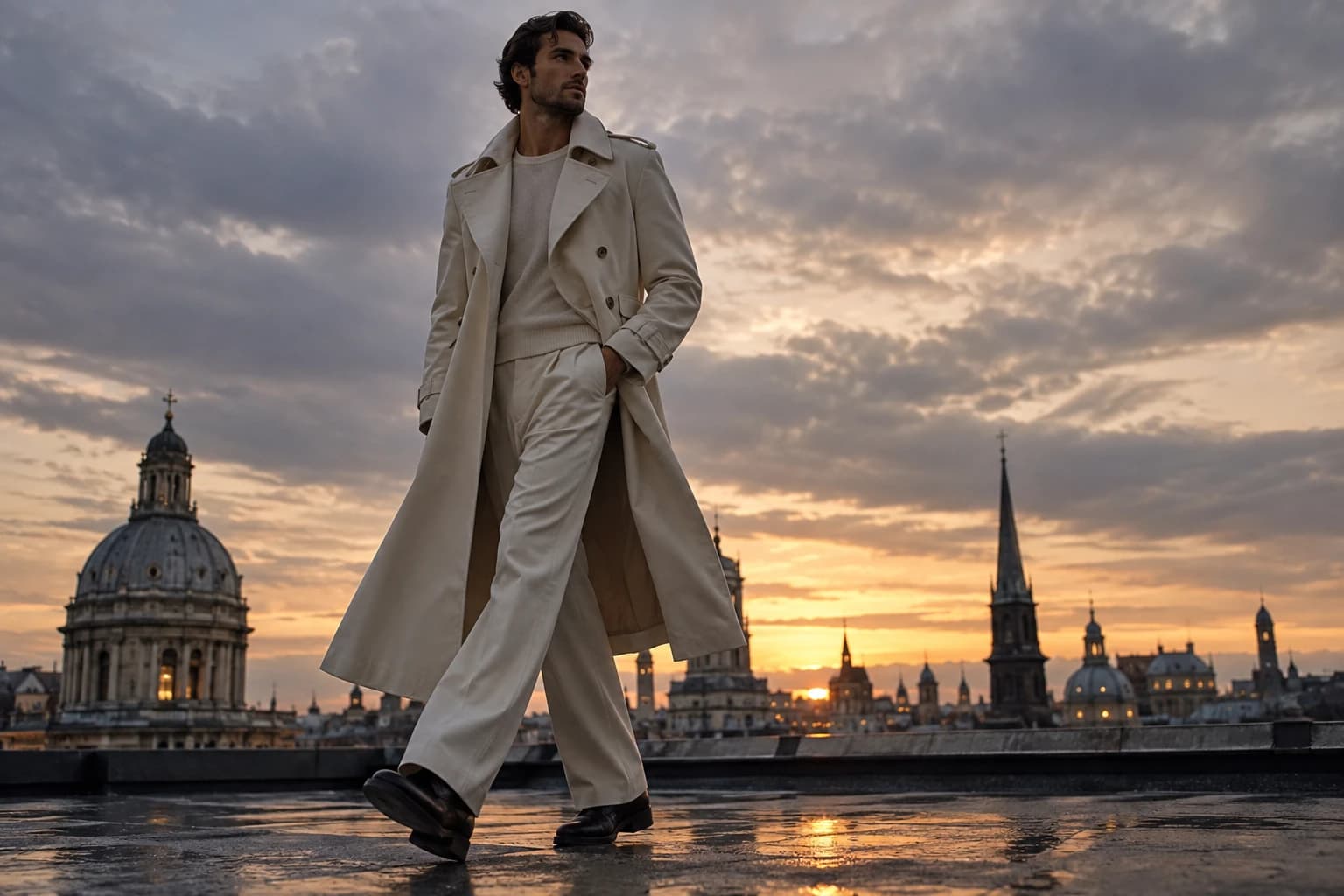
The three directions should feel like the same brand making three different arguments. Use a shared palette, comparable product scale, and a consistent treatment of typography. If one advertisement is a close-up with a discount banner and another is a distant lifestyle scene with no offer, the resulting comparison will be difficult to interpret.
Decide what the test is allowed to teach you
Write down the question before launch: for example, does an occasion image attract more qualified product-page visits than a detail image? Choose a primary measure appropriate to that question and a guardrail further down the journey. A striking advertisement that attracts irrelevant clicks is not automatically a useful winner.
Keep audience, placement, offer, and landing destination comparable where possible. Account for the platform's delivery differences when interpreting results; equal creative effort does not guarantee equal exposure. Avoid ending a test solely because one early result looks exciting. Small samples can mislead, so treat uncertain outcomes as reasons for another focused test.
Save the learning with the asset. Record the premise, the final creative, the destination, and what you would change next. The lasting value is a clearer understanding of what customers respond to, which makes the next brief more precise.
Research & sources
These findings describe the named studies and companies. They provide context, rather than measuring Atellia or establishing the effect of the advice above. Source dates are separate from retrospective theme years.
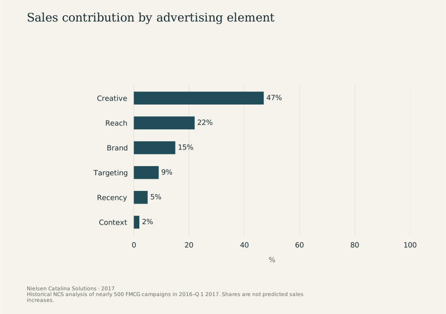
Sales contribution by advertising element
2017 · %
View chart data
| Measure | % |
|---|---|
| Creative | 47 |
| Reach | 22 |
| Brand | 15 |
| Targeting | 9 |
| Recency | 5 |
| Context | 2 |
Study scope and numerical references
- Creative's estimated contribution in the advertising analysis: 47 %. Nearly 500 FMCG campaigns, 2016–Q 1 2017; not a fashion conversion uplift. Nielsen Catalina Solutions, 2017