Give every product image a clear role, from first impression to the details that help a shopper decide.
The starting point
A useful product gallery behaves like a patient salesperson. It introduces the item, shows the parts worth noticing, and answers the questions that follow. A gallery filled with near-identical poses may look abundant while leaving basic information hidden. Plan each frame around a distinct question instead.
Begin with the product and the customer context. What is unusual about the item? What might be difficult to judge online? What do customers ask support before or after buying similar pieces? Those questions provide a more practical shot list than copying the gallery length of another store.
Establish the first clear view
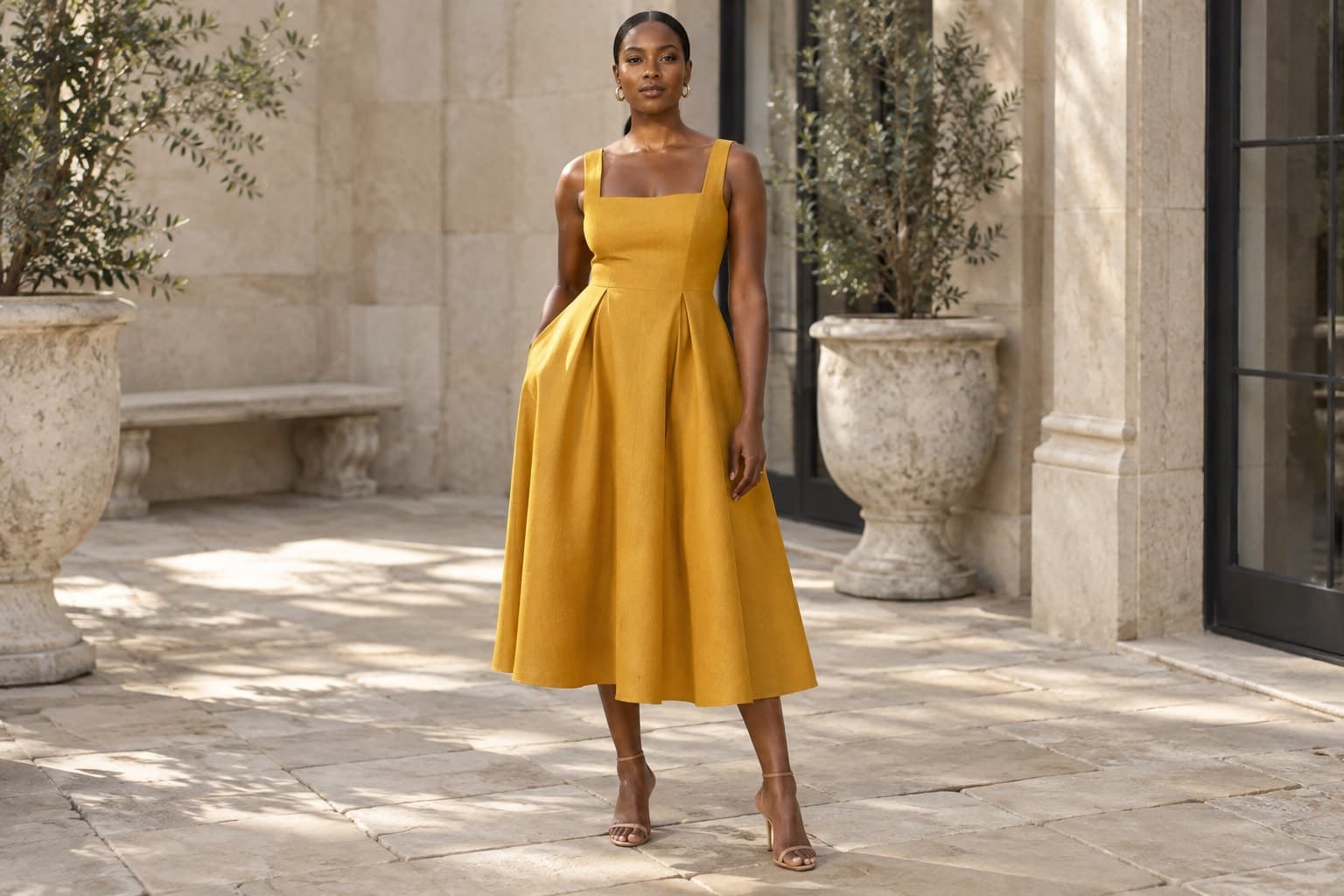
The opening image should make the item easy to recognize at its intended size. Consider the silhouette, the amount of surrounding space, and how it sits beside neighboring products in a collection grid. Avoid an expressive pose that hides the feature the customer most needs to see.
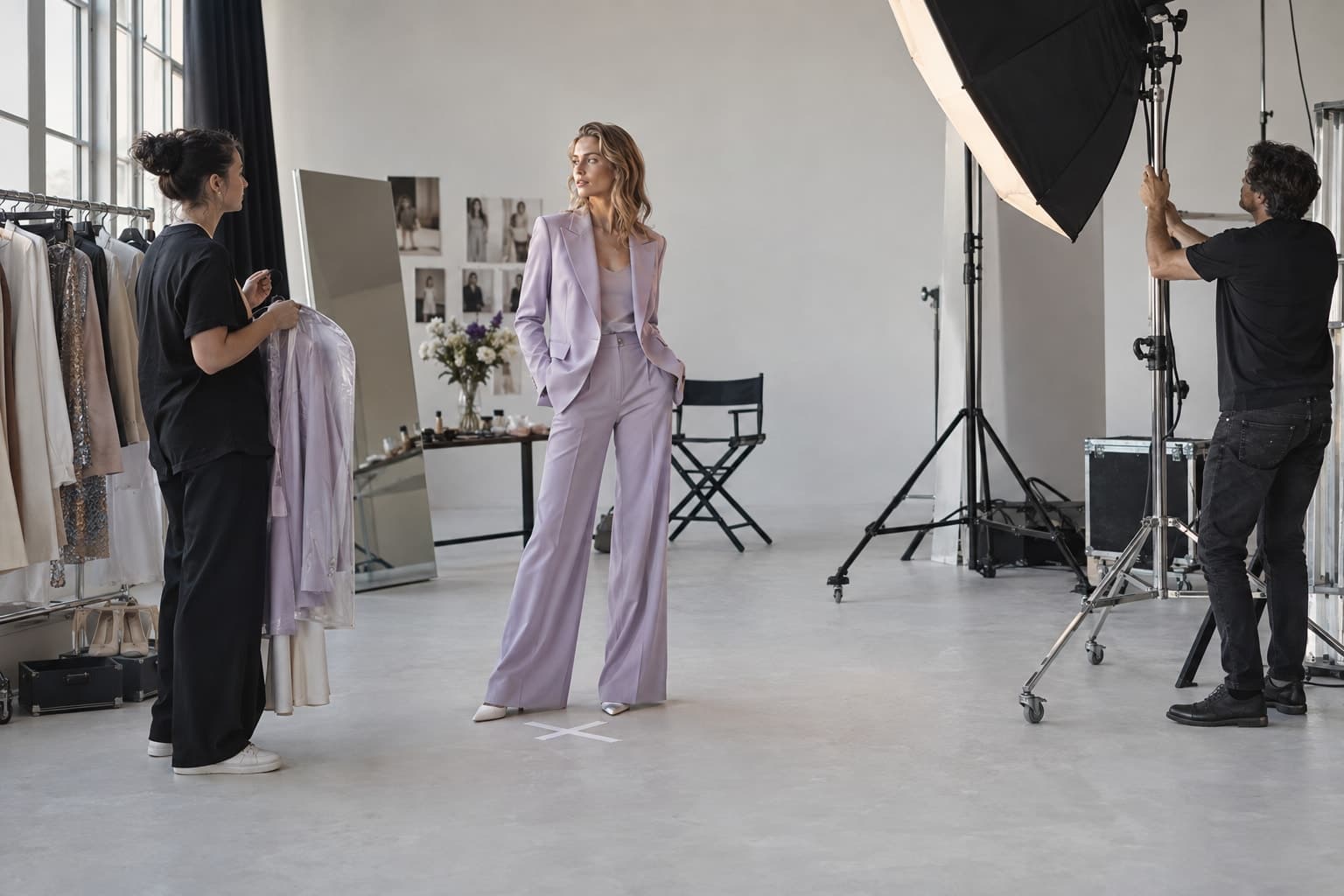
A styled image can help communicate the product's place in an outfit. Keep the featured item unambiguous, especially when accessories or layers are not included. The surrounding page should make it clear what is for sale. Styling is an invitation to imagine, not permission to leave the offer vague.
Answer the next questions in sequence
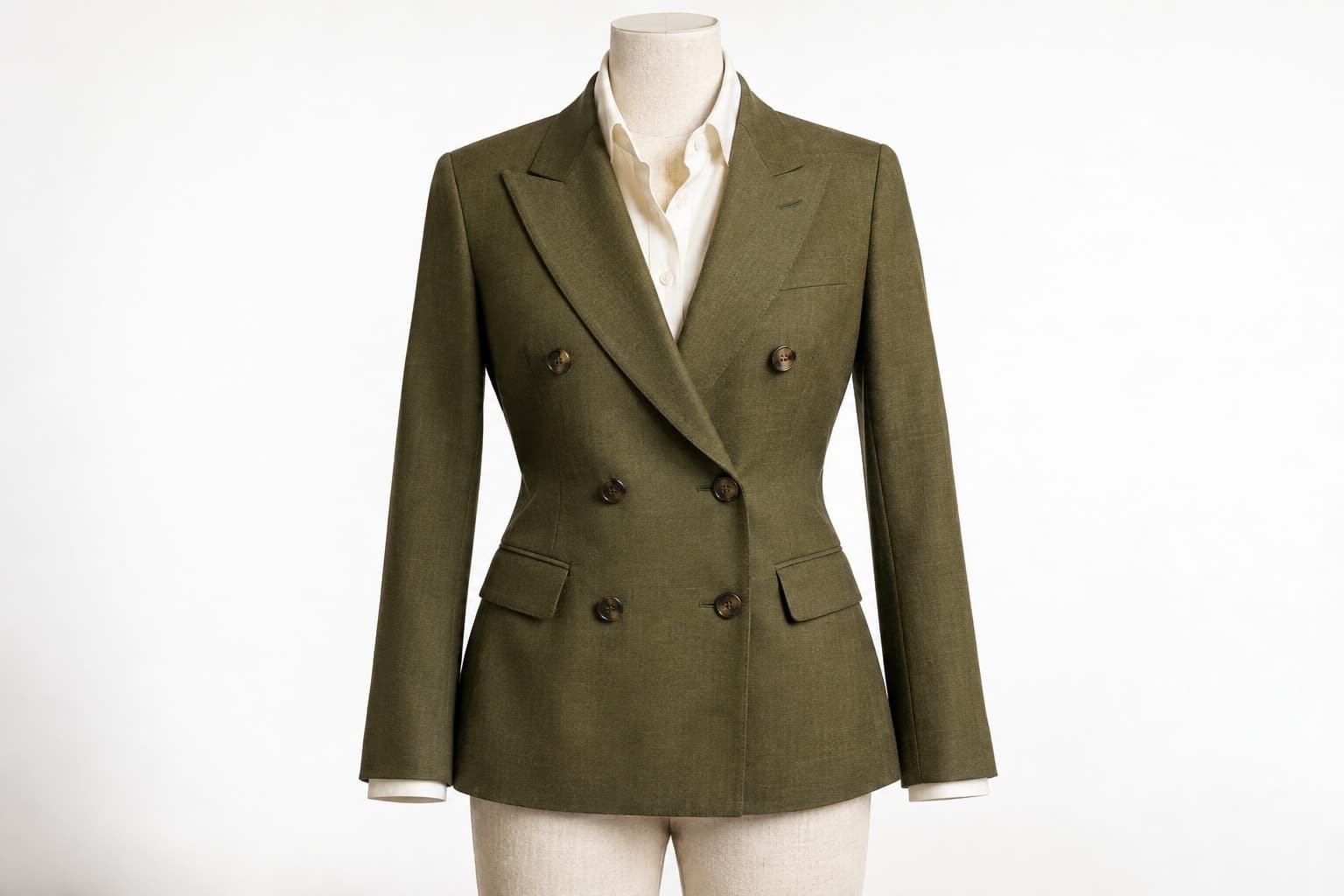
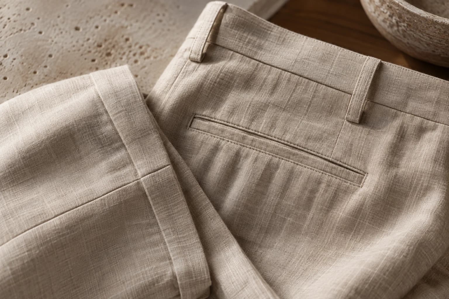
Move from overall shape to important details. A back view may reveal a closure. A side view may clarify volume. A close crop may show a weave, lining, or fastening. If two frames answer the same question, consider whether one should be replaced by information that is missing.
For a hypothetical lightweight jacket, the sequence might show the full front, the back, an open view of the lining, the cuff fastening, and the pocket. The best order depends on what distinguishes that actual jacket. There is no need to force every product into an identical set of poses.
Keep visual context separate from fit evidence
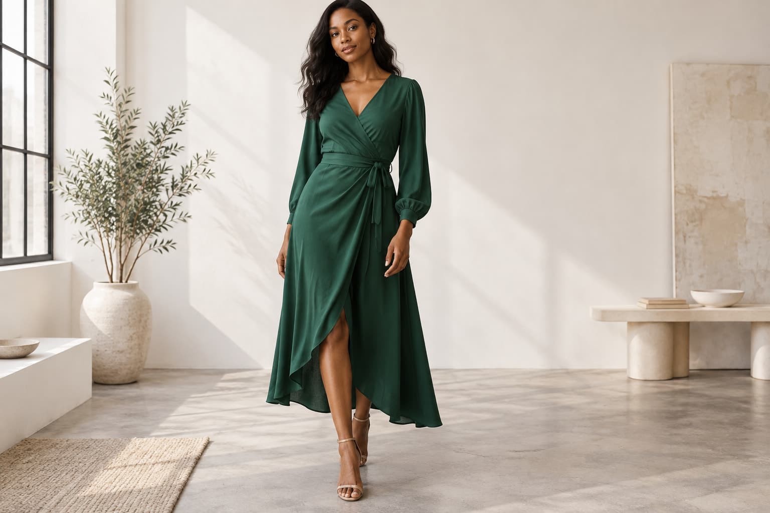
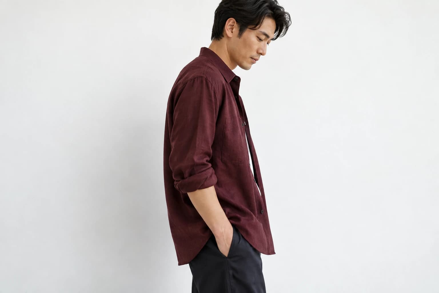
An on-body image can show how a garment is styled and its appearance on one subject. It does not establish how every size will fit every person. Provide accurate measurements and relevant sizing context alongside the gallery. If an image is generated, review the garment carefully and avoid presenting synthetic proportions as measured evidence.
Use real close-up photographs when exact construction or material is difficult to preserve in generated imagery. Different image types can work together. The editorial frame establishes a mood; a verified detail confirms the item. Neither needs to pretend it serves every purpose.
Review the gallery as a customer
Open the page on a small screen. Move through the images without reading internal filenames or production notes. Check whether the crop hides anything important, whether the order feels coherent, and whether every image belongs to the selected color variant. Ask someone unfamiliar with the item to describe what remains unclear.
- Can the customer identify the product immediately?
- Are distinctive features visible without guessing?
- Does the gallery accurately match the selected variant?
- Are material and construction questions answered somewhere?
- Do the images and written description tell the same story?
Use this review to revise the shot list for the next session. Photography improves when the team learns from actual uncertainty rather than simply adding more assets. A concise gallery with a clear progression can feel more complete than a long one that repeats the same attractive angle.