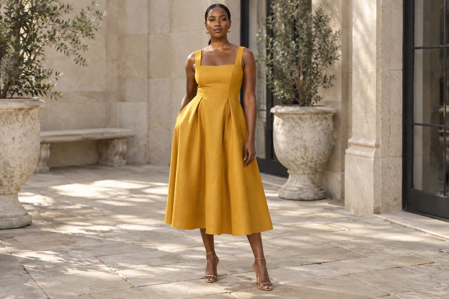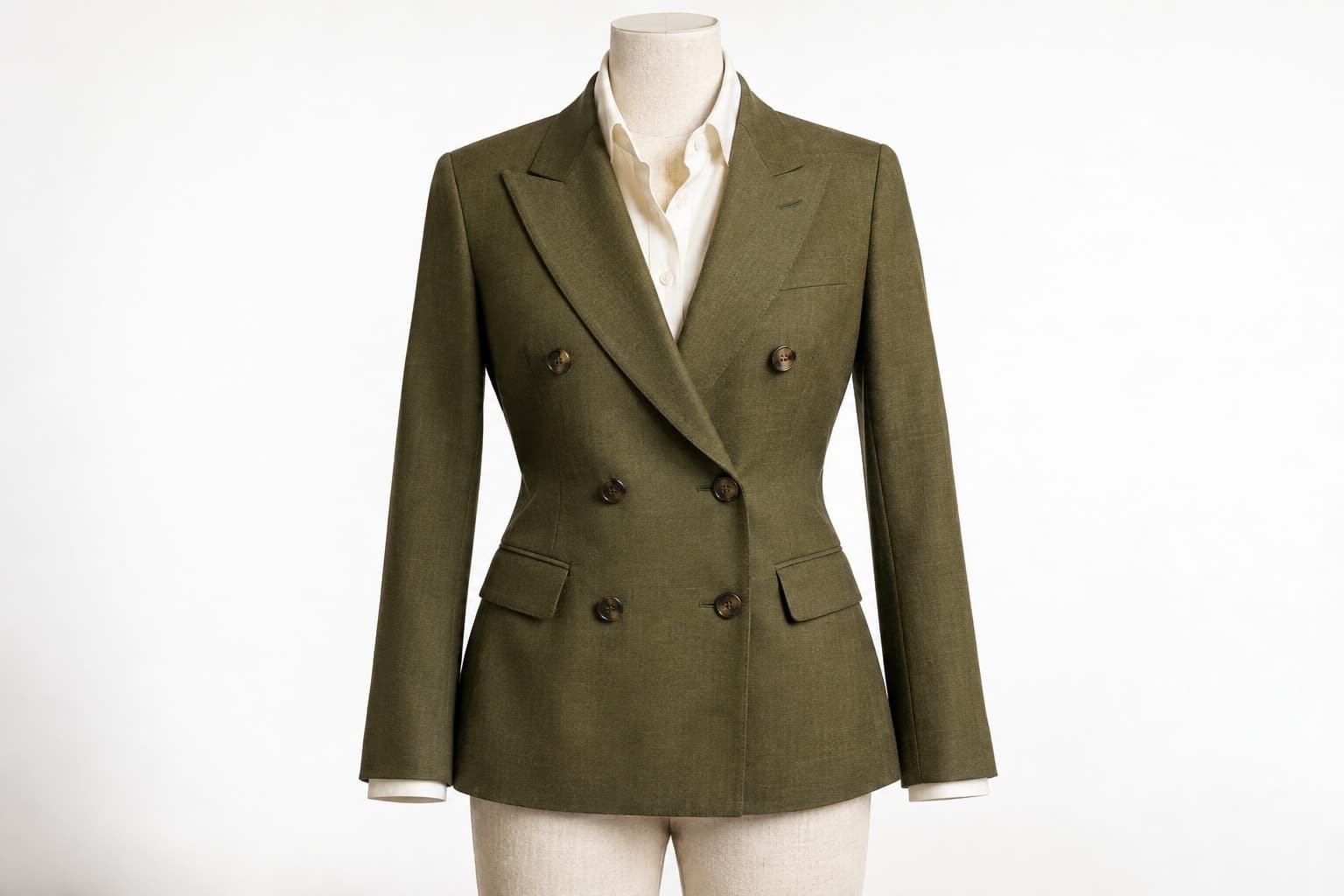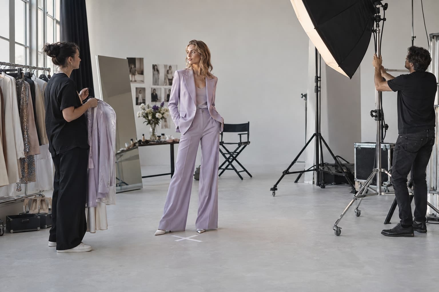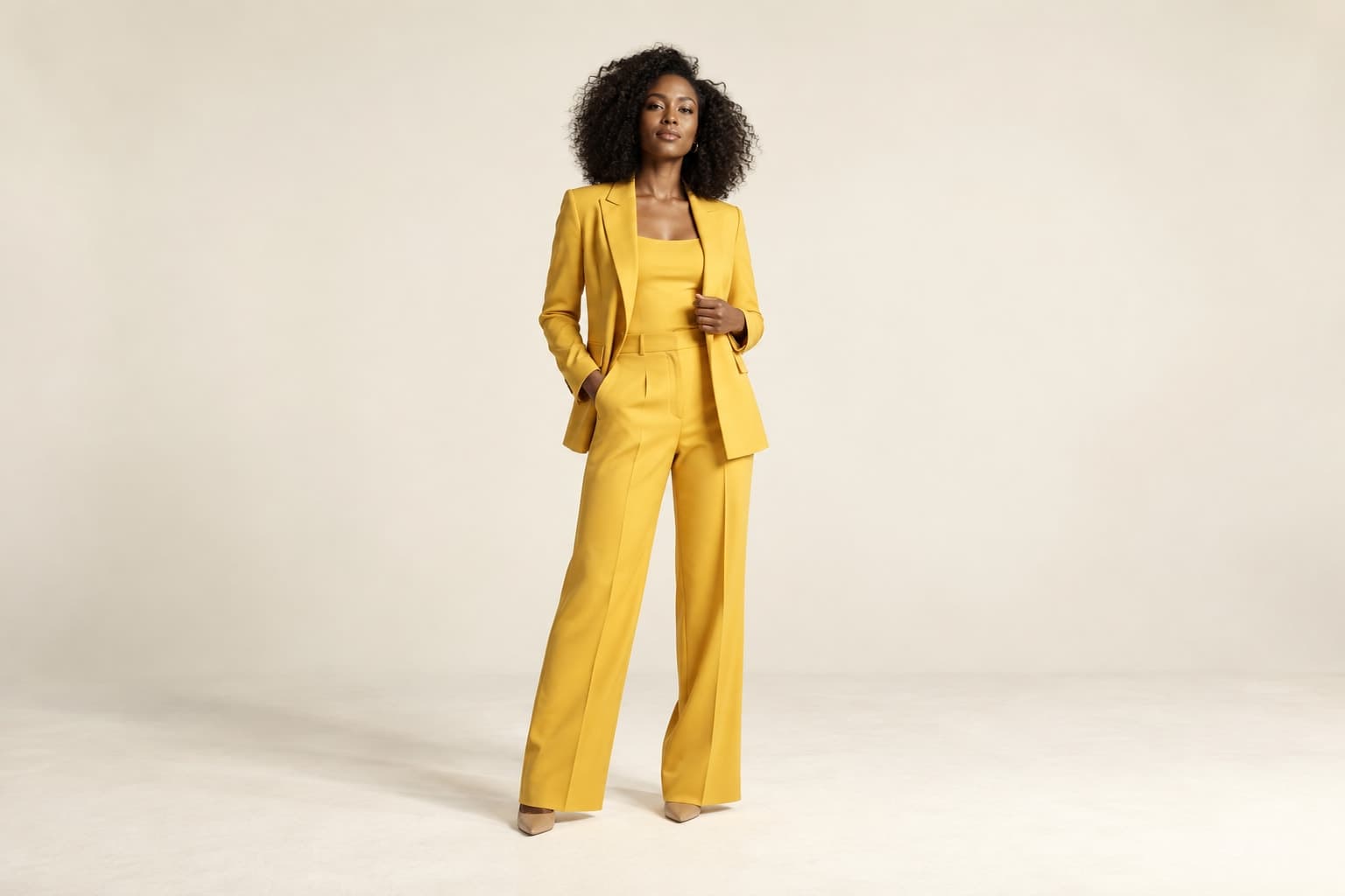
Plan portrait-friendly fashion imagery with deliberate subject placement, crop variants, and mobile readability checks.
The starting point
A portrait image is not simply a landscape photograph with the sides removed. The composition needs to support a different relationship between the garment, subject, background, and any text. Plan that relationship before the shoot or generation session. Retrofitting a narrow crop later can remove the very product information the picture was meant to communicate.
Begin with the placement
Collect the actual destinations for the image: a product card, a campaign panel, a story frame, or another specific placement. Confirm the current dimensions and interface overlays for those destinations. Do not rely on a remembered universal ratio. Different placements can require different versions even when they all appear broadly vertical.
Sketch the space the garment needs, then mark the area for copy and interface elements. A full-length dress may need more uninterrupted height than a cropped jacket. A strong hand gesture may need extra side room. The product and intended communication should determine the framing rather than a template chosen in isolation.
Capture deliberate alternatives
Photograph or generate a version designed for the narrow placement instead of assuming a wide master will solve everything. Keep some additional space around the subject for adjustment, but do not place the person so far away that the garment becomes unreadable. Review the likely crop while the setup is still available.
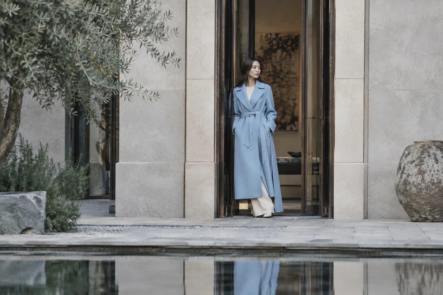
For a hypothetical coat campaign, one composition could preserve the complete silhouette while another focuses on the collar and closure. These versions do different jobs. Trying to make one frame serve as both a full product view and an intimate portrait may weaken both uses.
Use the background to support the shape
A portrait composition can feel crowded when strong background lines intersect the garment or subject. Check where edges, shadows, and props sit. Move them intentionally rather than relying on a later crop. Negative space is useful when it gives the clothes room or creates a clear place for text, not merely because an empty area looks sophisticated.
Watch the relationship between the top and bottom of the frame. A large empty area above the head may be appropriate for a campaign headline, but unnecessary for a product gallery. A close crop at the ankle or sleeve can look accidental if it removes a meaningful part of the silhouette.
Test the image at its real size
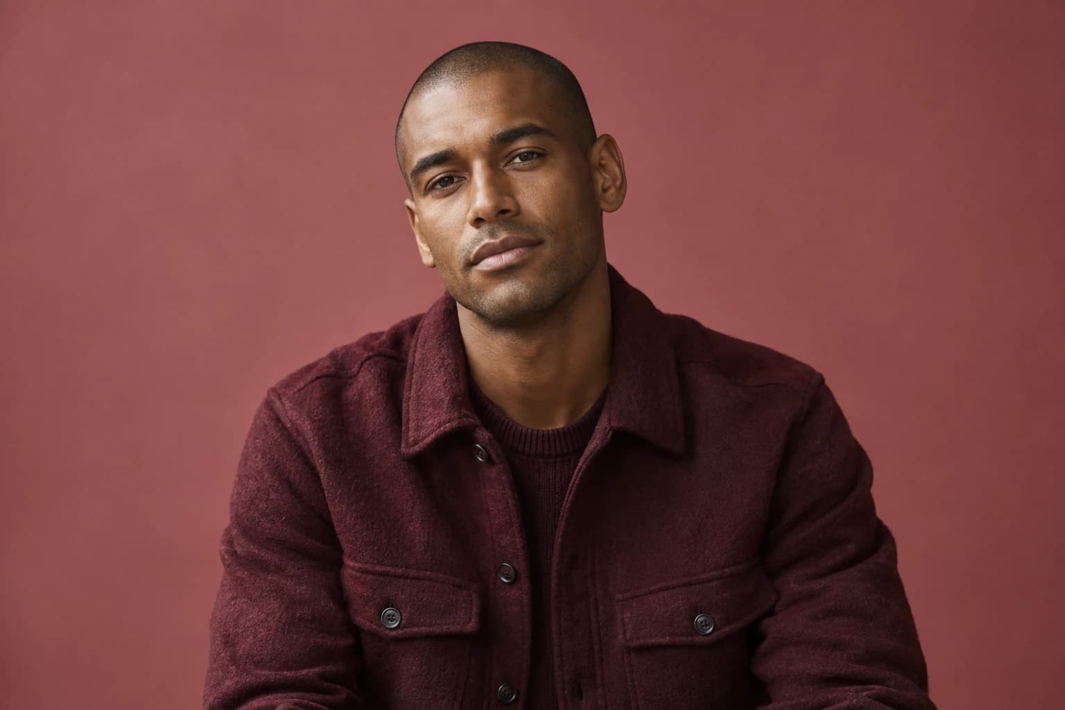
Open the intended placement on a phone. Check whether texture, closures, and the main styling idea remain readable. A composition that looks elegant on a large monitor can become ambiguous when reduced. If the garment loses its distinguishing details, a closer alternative may be needed rather than more sharpening.
For generated images, inspect the uncropped output as well as the final version. A crop can hide an error temporarily without resolving product accuracy, and a later teammate may reuse the wider file. Mark which export is approved for which placement and retain the source reference used for the garment check.
Create a delivery sheet with the approved crops, text-safe areas, and intended uses. Include an example of a crop that should not be made if it would remove important product information. This gives future editors a practical boundary and helps the visual direction survive beyond the original shoot.